FINAL FILM POSTER

FILM POSTER RESEARCH
|
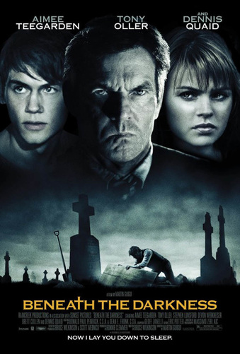
Colour:
The colour scheme used in the poster is dark as they have used black and grey specs of colour. The use of this colour scheme is effective in this poster because it creates a sinister atmosphere, which gives us a better insight into the storyline and what the movie is about - looking from the poster i can already tell that it is about death and crime, this is suggested by the dark colours they have used which have connotations of death and mystery. The text is written in brighter colours, for example the character names are in white and the main title is in yellow , this is a good choice of colour for this specific poster because the dark background means they need a bright title that is easy to see and read, if they were to use dark writing it would blend in with the background and would be impossible to read. Therefore, when creating our own poster if we are to use a black background, we need to ensure that the writing/titles are visible by using white/bright eye catching titles. |
Genre/storyline:
The genre and storyline is effectively reflected through the poster. The image showing the man going into a grave in a graveyard shows the audience it is a thriller/horror film because the connotations linked to that picture is death and ghosts which are typical conventions of a thriller/horror film. |
Character:
The fact that the three characters are on the front of the poster immediately lets the audience know that they are the main characters starring in the movie. Also the positioning of the characters on the front of the poster is also important as shown from the poster as Tony Olller is the one in the middle and they have used the biggest picture of him - this shows he is an important figure in the film, this is also effective for drawing in the actors fan base to view the film. The other two characters beside him on the left and right are shown in a smaller picture, showing their position in the movie. Therefore, in my own poster i would have to consider positioning the main characters from the teaser trailer correctly to show their importance and give a better insight into the storyline. Titles: The titles and tagline used in this poster is effectively used to attract the audience to watch the film. It says "Now i lay you down to sleep", this line is used on the poster to achieve its sole purpose which is to give the audience an insight into the storyline as well as creating a sinister feel for the audience, making the audience want to see the film . The title is in yellow so that it attracts the audience, it has a cross on the title portrays a image of a graveyard. |
|
Costume:
The poster has a light beige background colour which has been used instead of white so that the poster doesn't look plain or too simple and the rest of the elements are either black or red. This makes them stand out against the light background. The film title is in the same font as shown in the trailer making it noticeable to the audience. The character shown in the poster is James Bond in a suit and the designers of this poster have used a silhouette of him holding a gun. This simple yet effective technique has been used as a regular image of him would be too harsh on the background an might mean more elements will be needed on the poster. This design is very effective and they have used the 3 idea of 3 colours to its all potential to make this extemely effective poster. |
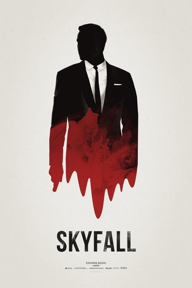
Layout and Font:
The layout of this poster is extremely simple and the designers for this poster only included the main elements. The film title, the release date and arguably the most important of the all, the character. The layout is quite clean and its recognisable to the majority. The poster gets straight to the point through the layout. Also by using elements such as the gun, the suit, the red to signify blood alongside the dripping effect all tell us that its a bond film. |
Genre/convention:
Although it is such a simple poster, it still clearly shows the genre of the film of it being a crime/thriller film. The fact that James bond is a silhouette shows the movie contains a lot of mystery and makes the audience more intrigued. The gun in James bond and is emphasised by the outline and red colour, again using typical conventions of a thriller film through the prop Costume: The costume is very clear to the audience and matches the theme of the film. James bond is wearing a suit and the black and white silhouette effect makes him in the costume bold against the rest of the poster. . |
|
This edition of empire magazine focuses on the new release of the James Bond franchise titled 'Spectre' it has a colour scheme consisting of red, white, black and grey, this really creates a focus on the title of the film and the information surrounding it, furthermore due to the colours being unchanging it allows the magazine cover to really stand out.
Costume: The costumes are very stereotypical as suits are constantly used in James Bond Films, in this cover the villain is easily distinguishable as he is wearing black and his body is facing another direction showing he is not on an opposing side from James Bond, the background helps both characters to really stand out, lastly the magazine have deliberately chosen Bond to be wearing a smart suit to appeal to female fans and to wider audiences. |

|
